Many buyers ask for price first. That sounds efficient. But it often leads to the wrong tote, weak store fit, poor print effect, and costly rework later.
Campus shops and museum shops need different canvas book totes. Campus stores usually need practical, comfortable bags for daily carrying. Museum shops often need totes with stronger visual appeal and artwork fit.1 The best choice starts with use, display setting, and brand message, not price alone.
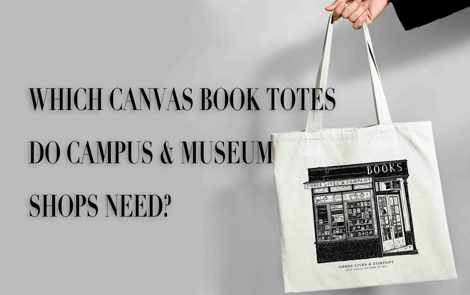
I have handled many tote inquiries like this. A buyer sends a simple message and asks for 12 oz canvas, long handles, and a quote. I used to see this all the time. Then samples start, and the real needs come out one by one. The bag is for heavy textbooks. The shop wall display is narrow. The artwork has fine lines. The customer wants it to feel premium, not just durable. That is why I always slow the conversation down at the start. A canvas book tote is not just a fabric bag. It is a retail product with a job to do in-store and after purchase.
Why Do Campus Stores and Museum Shops Use Canvas Book Totes?
Many people group these two channels together. I do not. When buyers do that, they often choose a generic bag that fits neither store well.
Campus stores usually use canvas book totes as practical daily bags that carry books and show school identity. Museum shops often use them as visual products that carry artwork, memory, and gift value. The same tote style rarely serves both purposes equally well.2
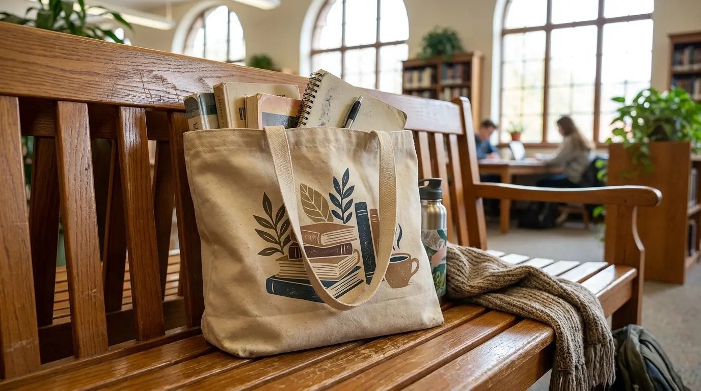
When I talk with buyers, I first ask where the tote will sit in the shop and why people will pick it up. This question changes everything. In a campus store, the tote often competes with backpacks, hoodies, notebooks, and drinkware. It needs to feel useful right away. The customer may imagine carrying books across campus, going to class, or using it every day. So the bag should open easily, sit well on the shoulder, and feel stable under weight. If the handle bites into the shoulder, the bag fails even if the canvas is thick.
In a museum shop, the tote often works more like a visual object. The artwork matters more. The print placement matters more. The fabric surface matters more. The bag may still carry books, but the buyer often wants a keepsake feel. I have seen museum-style projects fail because the bag was too generic. It was durable, yes, but it did not match the artwork or the story behind the collection.
I often explain the difference to buyers with a simple table:
| Store type | Main role of tote | Most common risk | Better focus |
|---|---|---|---|
| Campus shop | Daily use and school identity | Too stiff, uncomfortable, too bulky | Carry comfort, structure, practical size |
| Museum shop | Visual appeal and collectible feel | Print looks cheap or loses detail | Fabric-print match, artwork presentation |
This is why I do not recommend starting with fabric weight only. A heavier bag may look strong on paper. But if it feels hard, folds badly, or makes the print look rough, it may be the wrong product. I have learned that retail fit comes first. Specs come after that.
What Canvas Weight Is Suitable for Book Totes?
Buyers often ask for heavier canvas because they want quality. I understand that. But heavy canvas is not always better in real use.
For most book totes, medium to heavy canvas can work, but the right weight depends on what the bag must carry, how soft it should feel, and how the print should look. I usually judge fabric weight together with structure, handle comfort, and artwork needs.
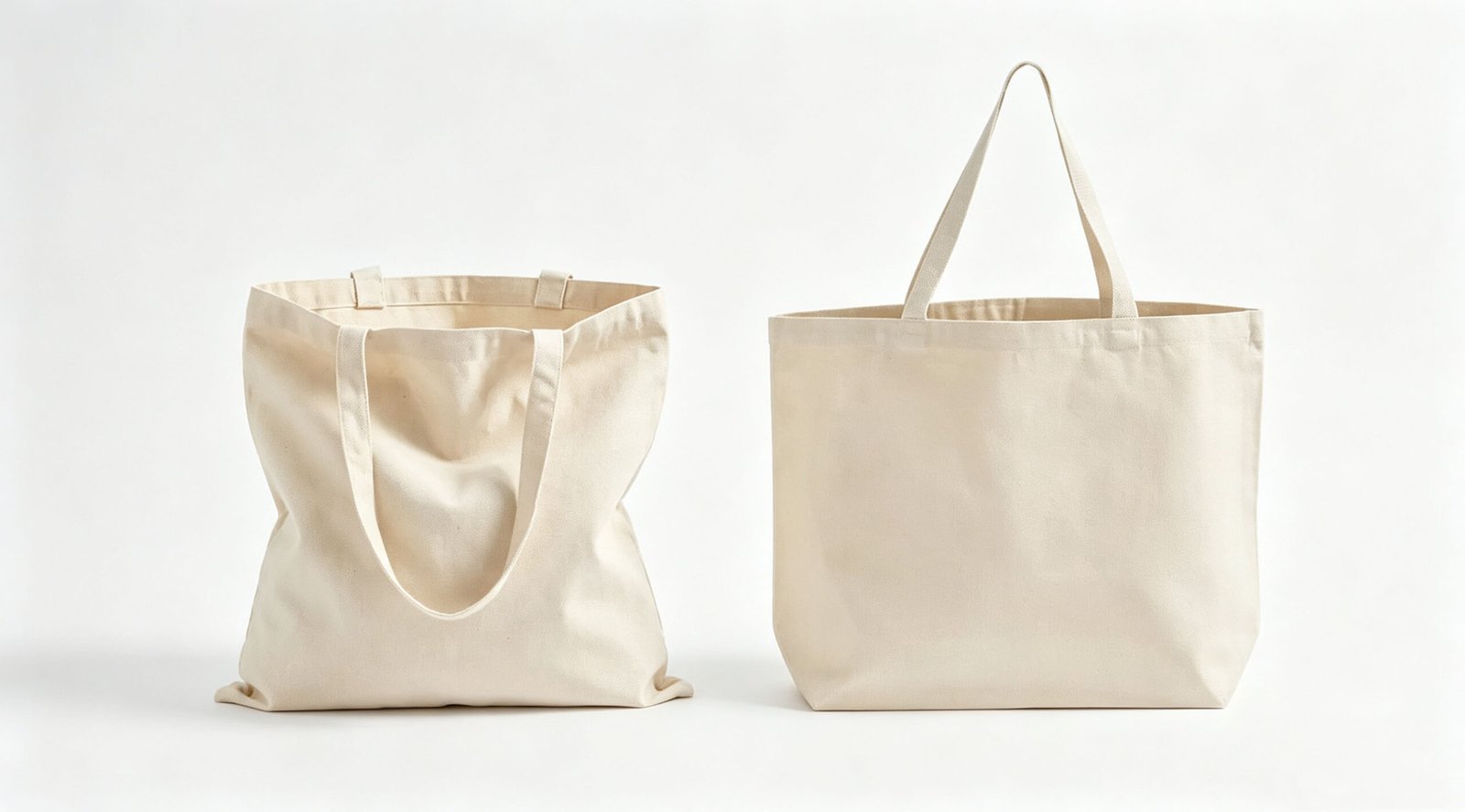
I have seen many buyers lock onto one number, like 12 oz or 16 oz, before they know what result they want. That can cause problems. A tote that carries books needs support, yes. But support does not come from weight alone. Fabric weave, bag width, bottom shape, and seam build also matter. A very heavy canvas can make the bag feel solid at first touch. That sounds good. But it can also make the opening too stiff, the fold too bulky, and the shoulder carry less comfortable.3
For campus use, I often look for a balance. The bag should hold books without looking limp. At the same time, it should not feel like a tool bag. If students use it often, softness matters. A bag that looks strong but feels harsh will not become a favorite daily bag.
For museum shops, I often ask another question: what does the artwork need? Fine art prints, line drawings, and detailed layouts may look better on a canvas surface that is smoother and less rough.4 In some cases, a slightly lighter or more refined fabric gives a better result than a heavy textured one.
Here is the way I usually explain it:
| Fabric direction | Good point | Risk | Best use |
|---|---|---|---|
| Lighter canvas | Softer hand feel, easier print clarity, easier fold | May feel too thin with heavy books | Museum graphics, lighter retail use |
| Medium canvas | Better balance of support and comfort | Needs good construction to avoid sagging | Most campus book totes |
| Heavy canvas | Strong first impression, more body | Can feel stiff, bulky, rough on shoulder | Structured tote if comfort is still controlled |
I once worked on a sample where the buyer first asked for very heavy canvas because they feared returns. When the sample arrived, the bag looked dense but not friendly. The handle also felt hard under load. We changed the fabric and adjusted the construction. The second sample felt better at once. That kind of change is common. So I do not treat weight as the first answer. I treat it as one part of the answer.
How Should Handles Be Reinforced?
A book tote can fail at the handle long before the body fails.5 Many buyers focus on canvas weight and forget the carry point that sees the most stress.
Handles should be reinforced based on load, handle length, and carry style. For book totes, I usually recommend strong stitching at the handle root, enough stitch area, and a handle material or folded construction that stays comfortable under weight.
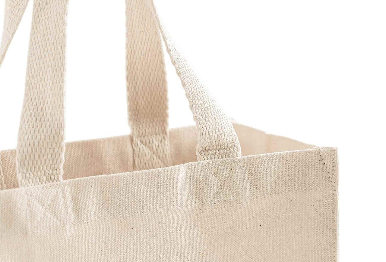
This is one of the most practical topics in tote development. I have handled many samples where the body fabric looked fine, but the handle setup was weak. Sometimes the stitch box was too small. Sometimes the handle webbing was too narrow. Sometimes the handle drop was long, but the bag was expected to carry heavy books. That adds stress and swing, and then the tote feels worse in use.
For campus shops, handle comfort matters a lot. A tote can be technically strong but still unpleasant to carry. If the edge feels sharp or the handle cuts into the shoulder, users notice that very fast. I usually check three things together: width, attachment area, and softness. A wider handle can spread pressure.6 A larger reinforcement area can improve strength. A better folded handle build can feel less harsh than a flat stiff strap.
For museum shops, the handle still needs strength, but visual clean lines may matter more. In that case, I try to keep the reinforcement reliable without making the tote look too industrial. The outside look should stay neat.
This table shows the usual points I review:
| Handle factor | Why it matters | Common mistake | Better approach |
|---|---|---|---|
| Handle width | Affects shoulder comfort | Too narrow for heavy load | Match width to likely load |
| Stitch reinforcement | Affects durability at stress point | Small stitch area | Use box stitch or cross reinforcement with enough area7 |
| Handle drop | Affects carry feel and balance | Too long for heavy books | Keep practical shoulder or hand carry length |
| Handle material/build | Affects feel and look | Stiff and rough touch | Use softer folded or better-finished handle where needed |
I always tell buyers that a reinforced handle is not just a strength feature. It is also a user experience feature. If the tote is meant to carry books, the user feels the handle before they judge the seam. That is why I never treat handles as a small detail.
What Printing Methods Work for Detailed Artwork?
A good tote can still look cheap if the print method does not fit the artwork. This happens more often than many buyers expect.
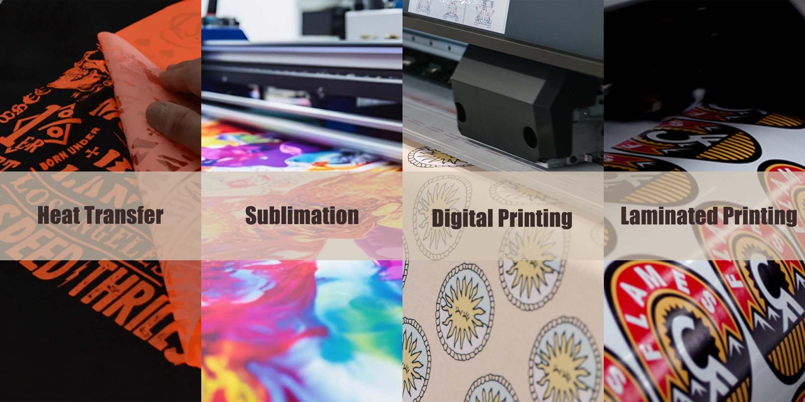
Detailed artwork needs a print method that matches the fabric surface, line detail, color needs, and order plan. Screen printing works well for bold art. Digital or other fine-detail methods may suit complex artwork better.8 The tote fabric must support the print, not fight it.
This is where campus and museum projects often separate even more clearly. In campus shops, graphics are often simpler. A school name, crest, slogan, or bold one-color layout can work well. In those cases, the print method can be straightforward if the bag surface is stable enough. The goal is clean branding and repeat consistency.
Museum shops are different in many projects I see. The artwork may include brush texture, thin lines, layered colors, or a more curated look. If the canvas is too rough or too open in weave, the print can lose detail.9 The image may look broken, soft, or cheap. The bag itself may be durable, but the retail impression drops.
I usually review artwork and fabric together before confirming a print direction. I do not like to approve print in isolation. A nice file on a screen does not guarantee a nice result on canvas.
Here is a simple comparison:
| Print method direction | Good for | Risk on wrong fabric | Best project type |
|---|---|---|---|
| Screen print | Bold logos, simple shapes, solid colors | Fine details may fill in or break | Many campus identity totes |
| Digital-style detail print | Complex art, fine lines, more image detail | Surface texture can disturb clarity | Many museum artwork totes |
| Minimal one-color branding | Simple, low-risk visual identity | Can look too plain for gift retail | Utility-focused campus use |
I remember one museum-style inquiry with beautiful artwork that looked perfect in the file. The buyer first chose a rough heavy canvas because they wanted a premium feel. When we tested the art, the detail got lost. We had to rethink the base fabric, not just the print. That project reminded me again that print is part of product fit. It is not decoration added at the end. It shapes whether the tote feels on-brand or off-brand.
What Should Buyers Check Before Ordering Retail Tote Bags?
Buyers often move fast once the quote looks fine. I understand the pressure. But a few missing checks can cause expensive trouble later.
Before ordering retail tote bags, buyers should confirm store use, target carry load, tote size, opening width, handle comfort, fabric-print fit, artwork placement, packaging, and approval samples. These checks reduce the risk of receiving a bag that is durable but wrong for the store.10
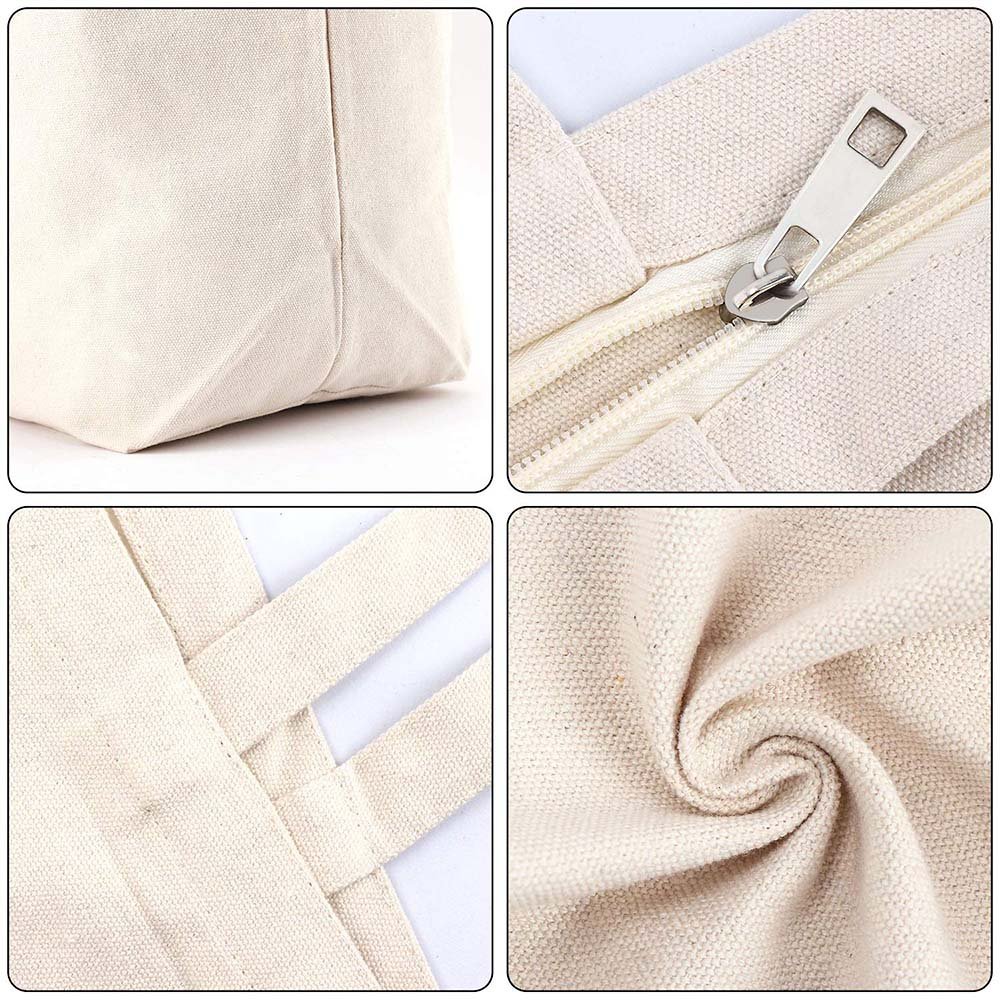
This is the stage where I try to protect both sides. I do not want the buyer to approve a tote that only looks correct on the spec sheet. I want it to work in the store and in the customer’s hand. So I ask direct questions. What will people carry? How will the tote be displayed? Is it folded, hung, or stacked? Does the artwork need to read from a distance? Is the bag meant to feel like a souvenir, a daily utility item, or both?
Many avoidable mistakes happen before production. The size looks fine in centimeters, but real books do not sit well in it. The handle drop works on paper, but not over a coat. The opening is too narrow for easy use.11 The print sits too low once the bag is filled.12 The fabric shade changes the artwork mood. These are small things at sample stage. They are big things after bulk production.
This is the buyer checklist I use most often:
| Check item | Why I check it | What can go wrong if missed |
|---|---|---|
| Use case | Sets the whole direction | Wrong bag type from the start |
| Store channel | Campus and museum need different outcomes | Generic tote that fits neither well |
| Load and size | Affects structure and comfort | Bag sags or feels awkward |
| Handle spec | Affects carry feel and stress | Uncomfortable or weak carry |
| Fabric + print match | Affects visual quality | Artwork looks cheap or unclear |
| Sample approval | Confirms real feel and appearance | Bulk order surprises |
| Packaging and display plan | Affects retail readiness | Poor presentation in store |
If I can share one lesson from experience, it is this: the best tote order usually starts with the clearest brief, not the lowest first quote. When buyers tell me how the tote should live in the store and after purchase, I can help much more. That is when the product becomes right, not just acceptable.
Conclusion
The right canvas book tote depends on the store, the use, and the artwork. I always choose retail fit first, then material, structure, handle, and print.
"(DOC) Museum store or a gift shop? A study of ... - Academia.edu", https://www.academia.edu/26763547/Museum_store_or_a_gift_shop_A_study_of_museum_store_from_a_merchandising_and_design_perspective. Studies of museum-shop consumption and campus retail purchasing can contextualize the claim that museum totes are often evaluated for souvenir or aesthetic value, whereas campus totes are more often judged for everyday utility and institutional identity; this evidence supports the channel distinction at a market level rather than proving it for every store. Evidence role: general_support; source type: research. Supports: Research on museum retail and campus retail should support the contextual difference between souvenir/identity-driven purchasing in museum shops and utility-driven student purchasing in campus stores.. Scope note: Support is contextual because individual stores may position products differently. ↩
"[PDF] Product Design Matters, But Is It Enough? Consumers' Responses to ...", https://digitalcommons.fairfield.edu/cgi/viewcontent.cgi?article=1254&context=business-facultypubs. User-centered design and merchandising literature generally holds that product specifications should be matched to intended use context and buyer expectations, which supports the article's claim that one tote configuration may not equally satisfy both utility-focused and visually driven retail settings. Evidence role: expert_consensus; source type: education. Supports: Design and merchandising literature should support the principle that products optimized for different use contexts and consumer goals often require different specifications.. Scope note: The support is indirect and establishes a design principle rather than measuring tote outcomes in these two channels specifically. ↩
"Comfort Evaluation of Wearable Functional Textiles - PMC - NIH", https://pmc.ncbi.nlm.nih.gov/articles/PMC8585350/. Textile and ergonomics research indicates that heavier or more rigid materials tend to increase bending stiffness and perceived bulk, factors that can reduce comfort in carried products when load-bearing surfaces contact the body. Evidence role: mechanism; source type: paper. Supports: Textile engineering and ergonomics sources should support that greater fabric mass and rigidity can increase stiffness and bulk and influence comfort during carrying.. ↩
"A Study on the Effect of Fabric Structure and Finishing on ...", https://repository.rit.edu/context/theses/article/11243/viewcontent/PSharmaThesis5_2019.pdf. Printing and materials studies show that substrate roughness and surface irregularity can reduce edge definition and fine-detail reproduction, supporting the statement that smoother fabric surfaces may better preserve detailed artwork. Evidence role: mechanism; source type: paper. Supports: Printing research should support that substrate smoothness and surface uniformity affect line fidelity and detail reproduction.. Scope note: The exact effect varies by ink system, pretreatment, and printing method. ↩
"Handbag Load Testing: Understanding the Handle Jerk ...", https://www.tradeaiders.com/es/handbag-load-testing-understanding-the-handle-jerk-test-oscillation-standards.html. Load-testing and sewn-product engineering literature identifies strap and handle attachment zones as high-stress regions in carried goods, which supports the claim that failure may occur at the handle root or seam before the main fabric panel fails. Evidence role: mechanism; source type: research. Supports: Engineering or textile testing sources should support that load concentrates at strap or handle attachment points, making them common failure locations.. ↩
"The effect of shoulder strap width and load placement on ...", https://pubmed.ncbi.nlm.nih.gov/29254136/. Ergonomic studies of load carriage report that increasing strap width can reduce peak contact pressure by distributing force across a larger area, supporting the article's statement about wider handles and comfort. Evidence role: mechanism; source type: paper. Supports: Ergonomics research should support that wider straps or handles reduce localized pressure by increasing contact area.. Scope note: Comfort outcomes also depend on load, padding, material stiffness, and duration of carry. ↩
"Sewing a Box X Stitch in Webbing & Breaking Strength Formula", https://www.youtube.com/watch?v=wf6buu7PqT4. Sewn-product construction guidance and seam-strength studies indicate that reinforced stitch patterns and larger attachment areas can improve load distribution at strap joints, supporting the recommendation for box or cross reinforcement. Evidence role: mechanism; source type: education. Supports: Textile construction or product engineering sources should support that reinforcement geometry and larger attachment areas can improve load distribution and seam strength.. Scope note: The effect depends on thread, stitch density, fabric strength, and manufacturing quality. ↩
"Screen Printing vs Digital Printing: Which is Best for Your Business?", https://www.youtube.com/watch?v=pf1I7yCst5s. Technical overviews of textile printing commonly note that screen printing is efficient for bold, limited-color graphics, whereas digital methods are better suited to complex imagery and fine detail, which supports the article's method-selection guidance. Evidence role: expert_consensus; source type: education. Supports: Printing technology references should support the general capability differences between screen and digital textile printing for simple versus complex imagery.. Scope note: Actual results vary with substrate, file preparation, color management, and production scale. ↩
"Influence of Simple and Double-Weave Structures on the Adhesive ...", https://pmc.ncbi.nlm.nih.gov/articles/PMC8876807/. Textile-printing research shows that coarse surface texture and open weave can disrupt ink laydown and reduce edge sharpness, supporting the statement that rough or open-weave canvas may cause loss of printed detail. Evidence role: mechanism; source type: paper. Supports: Research should support that coarse texture and open weave can interfere with ink deposition and edge definition in printed textiles.. ↩
"Pharmaceutical product development: A quality by design approach", https://pmc.ncbi.nlm.nih.gov/articles/PMC4991121/. Product-development and quality-assurance literature generally finds that clearer requirements, prototype review, and preproduction approval reduce the risk of specification mismatch and downstream rework, supporting the article's checklist-based approach. Evidence role: general_support; source type: research. Supports: Quality management and product development sources should support that requirement definition, prototyping, and approval sampling reduce specification and production mismatch risk.. Scope note: This evidence supports process risk reduction broadly and does not quantify tote-specific error rates. ↩
"[PDF] Ergonomics and Design A Reference Guide", https://ehs.oregonstate.edu/sites/ehs.oregonstate.edu/files/pdf/ergo/ergonomicsanddesignreferenceguidewhitepaper.pdf. Human-factors research on access and reach indicates that opening dimensions influence the ease of placing and removing objects, which supports the claim that a narrow tote opening can impair usability. Evidence role: mechanism; source type: research. Supports: Human-factors or ergonomics sources should support that opening dimensions affect accessibility and ease of insertion/removal of carried items.. Scope note: The practical threshold depends on the size and shape of the objects being carried. ↩
"The Impact of Visual Elements of Packaging Design on Purchase ...", https://pmc.ncbi.nlm.nih.gov/articles/PMC11851823/. Design research on form change and graphic application shows that deformation during use can alter perceived placement and legibility of printed elements, supporting the article's point that print position should be evaluated on a filled bag rather than only on a flat sample. Evidence role: mechanism; source type: research. Supports: Design or packaging research should support that product deformation during use changes the perceived position and appearance of applied graphics.. Scope note: Evidence is likely to be contextual across soft goods and packaging rather than specific to canvas totes. ↩